
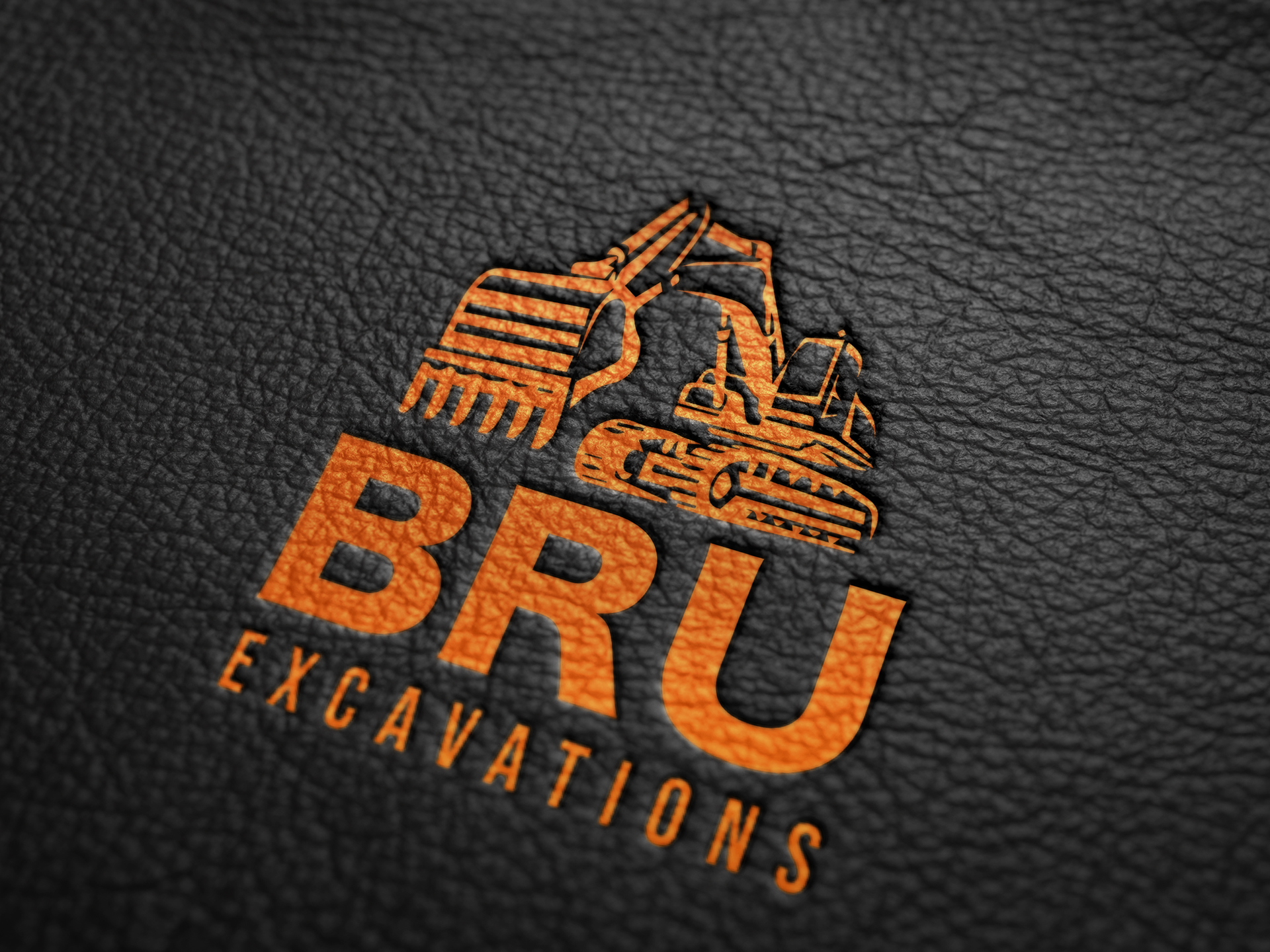
The logo I designed for Bru Excavations encapsulates the essence of this small family-run excavating business with a touch of simplicity and versatility. The design seamlessly bridges functionality and aesthetics, allowing it to be seamlessly integrated across various mediums – from uniforms to print materials and financial documentation. Its adaptability ensures a consistent and professional representation across all facets of the business.
While the design remains fitting for an excavating business, it boasts a uniqueness that sets Bru Excavations apart from its counterparts. The simplicity of the logo serves as a strength, ensuring recognizability while standing out in a crowded market.

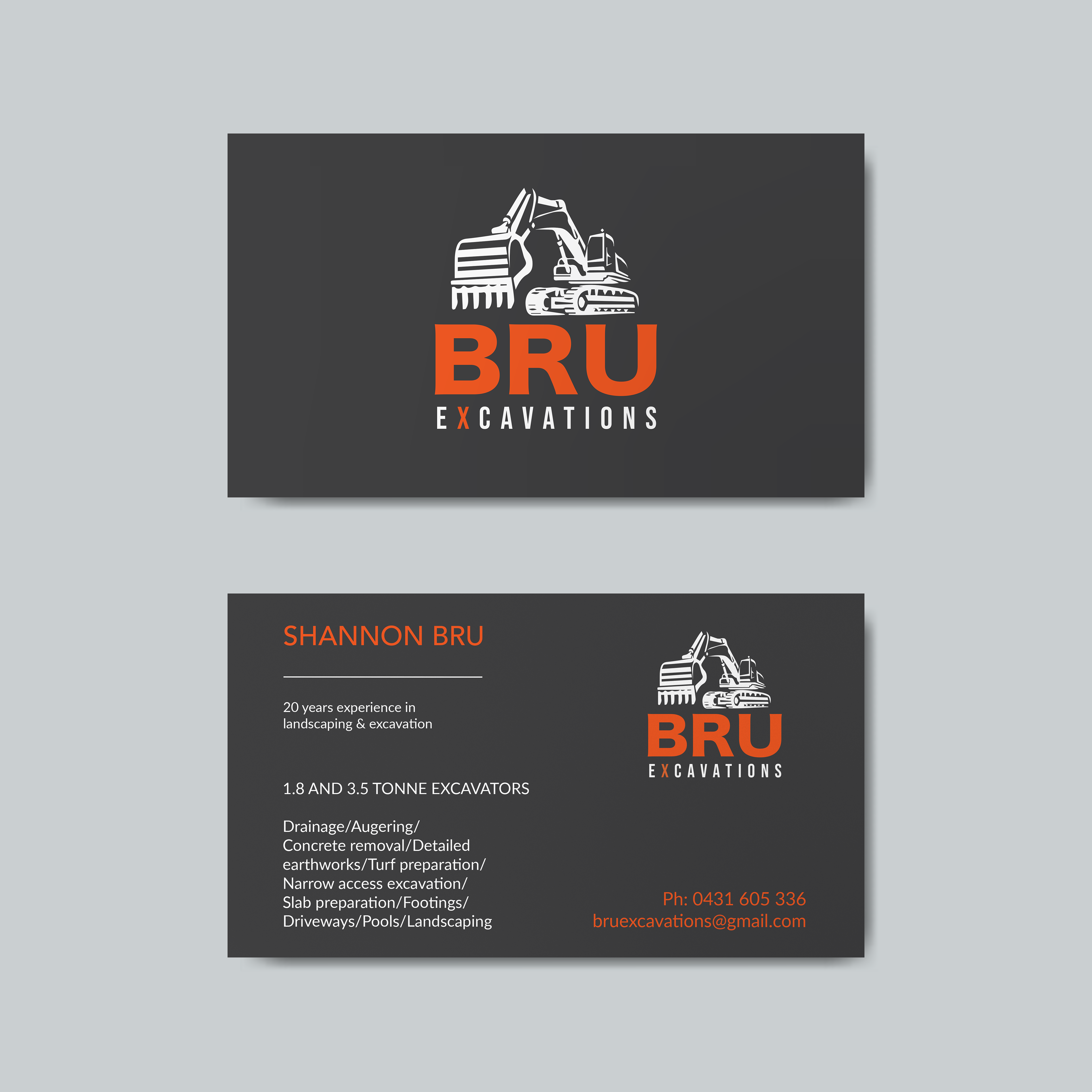
The accompanying business card design follows suit with a basic and masculine aesthetic, aligning perfectly with the industry's rugged and robust nature.